I don’t know if you’ve noticed, but more and more sites are starting to create and display their own “dark mode” theme. If you haven’t noticed, chances are it’ll be because you haven’t set up your device’s theme to be dark! That’s right, in many instances websites can look at the settings of your computer/tablet/mobile and adjust what (or how) they look and act to reflect that preference.
It’s a great concept - rather than a user having to go to every site they visit and set preferences on each, sites should do that hard work for you.
There are a few really useful settings, all of which can be checked and acted upon in the same way, that allow you to adapt your sites to be more inclusive and understanding of how your users like to access content. Here’s how!
prefers-reduced-motion
So much of the web takes advantage of movement. Whether that’s videos and gifs, or animations on just about everything thanks to the rise in popularity of parallax. For a lot of users though, it can be really unsettling:
“As animated interfaces increasingly become the norm, more people have begun to notice that large-scale motion on screen can cause them dizziness, nausea, headaches, or worse. For some, the symptoms can last long after the animation is over.” 1
The best description I’ve found of the effect this has is from the a11y project:
Your personal steady-cam is broken. Whatever you look at tends to move regardless of if you are moving. 2
As you can tell then, it’s really important to allow users to let you know that they don’t want to see a lot of movement, and for your sites to respond to that request. That’s where the prefers-reduced-motion setting comes in - it will allow you to look for that setting and then reduce, or remove, the motion in your sites.
How do I check it out?
This preference can be set by a user on macOS by going to:
System Preferences > Accessibility > Display > Reduce motion.
Or on Windows, by going to:
Settings > Ease of Access > Display > Show animations.
Example
To showcase how you can check for the setting and adjust your site based on it, check out the code example below (you might want to hit re-run in the bottom right corner if you’re seeing a grey screen):
See the Pen a11y - Reduced Motion Example by Ashley Firth (@MrFirthy) on CodePen.
By default you’ll see a video of some waves on a beach that autoplays when the page loads. Once the video is done it transitions to a grey screen. Now try heading to your settings and apply the “reduce motion” setting. After that, if you refresh the page you’ll see that, instead of showing a video, it will show an image instead. This code is taking the user setting into account.
Ways to handle this in code
You have two options. The first is JavaScript, which the example above uses. You can use a function called matchMedia to check if the user has set the prefers-reduced-motion setting, and then execute some code if they have indeed set it. In the code below, if the user has asked for reduced motion, the code removes autoplay from the video and pauses it just in case:
if (window.matchMedia('(prefers-reduced-motion)').matches) {
    video.removeAttribute('autoplay');
    video.pause();
}
For things like animations that are set in CSS, you can also check for this setting there using the @media query. In the below example, there’s a pretty rapid animation in place. Again like the JavaScript example, we check whether the setting has been set and, if so, we remove the animation altogether.
/* An animation that makes a button vibrate quickly */
.animation {
    animation: vibrate 0.3s linear infinite both;
}

@media (prefers-reduced-motion: reduce) {
    .animation {
        animation: none;
    }
}
Between these two approaches, you’re guaranteed to have an easy way to adjust your code to make allowances for that user setting.
Where is it useful?
- 🎥 Videos
- 🌊 Animations (reducing their speed, or even stopping them from running)
- 💫 Parallax
- 🎨 Canvas
prefers-color-scheme
Dark mode is in vogue right now, and for good reason. There are a whole host of benefits - including helping to reduce eye strain, as well as saving battery life on your devices. Most importantly though, the light typically emitted from devices suppresses the secretion of melatonin, making it harder to sleep - dark mode reduces that.
So, how do we check if someone would prefer your site in dark mode, and give them what they want?
Example
See the Pen a11y - prefers-color-scheme example by Ashley Firth (@MrFirthy) on CodePen.
This one is nice and easy to showcase! Here we use CSS and change the background and title colours to be darker if the user has specified that they prefer a dark theme.
Note: Although we’re covering how to implement a darker mode into your site, he exact same concept works for adding a lighter mode! If you have a dark colour scheme, you can check whether a user has stated they prefer a light colour scheme and do the same:
@media (prefers-color-scheme: light) {
    ...
}
Browser Support
Support is actually really strong for this. The prefers-reduced-motion CSS query, for example, has over 90% support which includes all modern browsers (Internet Explorer is, unsurprisingly, the exception). The JavaScript side is even better though, with the matchMedia function having global support in modern browsers (including Internet Explorer 10 and up).
Potential future queries
There are a couple of queries that aren’t yet supported by modern browsers in the way these two are, but hold some interesting potential to help users in the future. Importantly, when they are supported, you’ll be able to implement them in the same way as the two shown above - using either JavaScript or CSS.
prefers-reduced-transparency
Quite well named, this setting would allow users to let sites know that they prefer to reduce the amount of transparent imagery or translucent layering of content.
Hypothetically, this is an example of what you might be able to do in CSS to cater to this setting when it’s supported.
.transparency {
    opacity: 0.5;
}

@media (prefers-reduced-transparency: reduce) {
    .transparency {
        opacity: 1;
    }
}
prefers-contrast
This setting would detect if the user has requested the system increase or decrease the amount of contrast between adjacent colours. It’s something that operating systems again sort themselves, most famously with Windows High Contrast Mode. Because of this, I’m a little concerned about clashes that could exist when a user has both a high contrast setting in place on their device, whilst a website is also changing their colour scheme to accommodate for that setting - two separate things attempting to improve contrast could actually make it worse. This is likely why this settings hasn’t immediately been implemented into modern browsers.
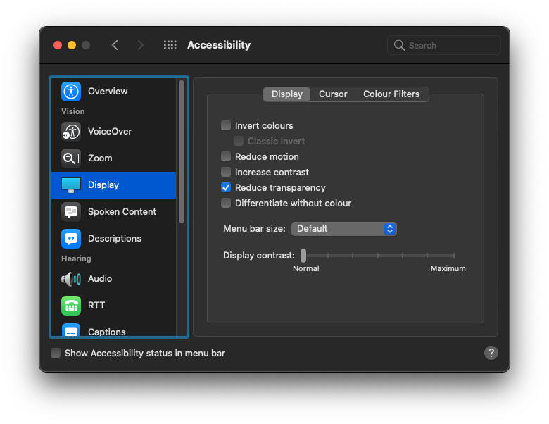
Both of these settings are currently exposed at an operating system level, so hopefully it won’t be too long before they can be supported by modern browsers. In MacOS, for example, you can find both settings in the Accessibility area of System Preferences.
Bonus: relative units
I can’t write a post about adapting to user settings without at least mentioning the power of using relative units (rem) when setting the size of elements (particularly text) in your websites. Users with visual impairments often increase the default size of text on their devices in order to avoid having to zoom in on content or squint to read it. Sites that use only static units however, like pixels, largely ignore this though. This is because pixels are a fixed unit - they don’t base their size on the default base font size of the device or browser. Relative units, however, take this setting into account, meaning that your text automatically adapts to the user’s preference.
What’s more, you don’t even need to set up a check for this setting like you do for those above. Instead, rather than setting a size in pixels, like:
p {
    font-size: 16px;
}
You set it in rem’s:
p {
    font-size: 1rem;
}
That’s all their is to it! If you’d like to understand a bit more about why using pixels isn’t the best idea, there is a great write-up you can read here.
Conclusion
Installing even one of these settings into your site shows a willingness to be flexible for your users. It’s important to remember that, although faithfulness to design is great, ensuring the people get to engage with your content in the way that works best for them, is even better.
If you hadn’t noticed, this site actually allows you to switch between a light and dark theme (hint: try clicking on the illustration on the top of the page). However, if you’ve set your device to use dark mode by default, you would have been greeted by the tasty dark theme automatically. Small things like this can make a big difference, and hopefully they’ll become more commonplace throughout the web in the future.
If you find great examples of sites responding to user settings, I’d love to hear about them! Give me a shout on Twitter @MrFirthy and let’s chat!