Design is what mediates our interaction with the internet. It’s the language we read it in. It’s not too much to ask that that language is comprehensible and honest. Harry Brignull
What is a dark pattern?
The phrase was coined by Harry Brignull, a UX designer. They are features of interface design crafted to trick users into doing things they might not want to do, but which benefit the business.
There’s a short video about it here if you’d like to check it out, and it’s prime example is my favourite - how do you go about cancelling your Amazon account?
You might start by heading to the “Your Account” page:
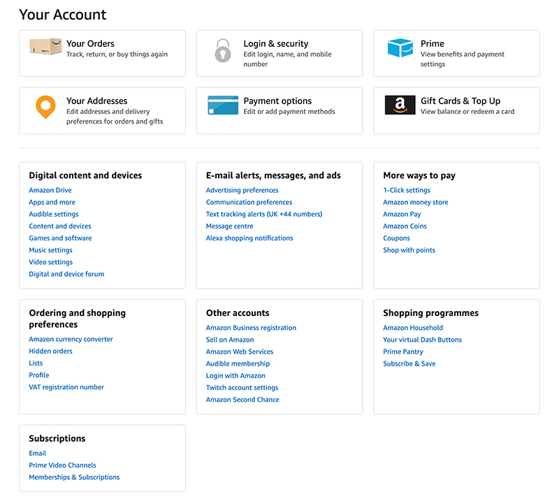
You could click any of these links but none of them would take you there. Here’s what you need to do:
- You scroll to the bottom of the page and select ‘Help’ out of the two-dozen links there.
- Of the 16 categories on the ‘Help’ page, you need to select ‘Contact us’
- Of the 4 tabs that appear there you have to select ‘Prime or something else’
- From the drop-down under ‘Something else’ you have to select ‘Login & security’
- From the next dropdown that appears you have to select ‘Close an account’
- Once here, you have to contact them directly to actually perform the action (this is a whole other problem which we’ll get to a little later)
This is an example of a dark pattern. This one is known as a “roach motel” - something that seems appealing and is easy to get into, but very difficult to get out of.
Why do sites use dark patterns?
Because it works, and they can get away with it. These practices are known to increase conversion, retention, and pretty much every other metric known to measure success for businesses online. It’s also difficult to legislate when it comes to leveraging human psychology, and so holding businesses accountable here is hard to do.
Part of the problem here is that there aren’t consistent ways to measure this impact. There is no mention of mental health disorders in WCAG 2.1. The closest thing in place is COGA (cognitive accessibility roadmap and gap analysis) - they’re working on a way to factor mental health into web accessibility, but anything iron-clad or ratified is a while away.
Now there isn’t necessarily an issue with encouraging a user to do something specific. It’s how you do it, and whether your design, UX, and functionality is balancing the need for success with the need to take care of your users.
Who is it affecting?
Everyone experiences the effects of these tactics online, but they apply so much to those with mental health-oriented access needs. Those who struggle with a lack of motivation, are susceptible to periods of impulsivity, and those that suffer from anxiety are consistently most affected. Medication can also have side-effects that make users more susceptible to these tactics.
We also don’t know accurately how many people it’s affecting. The charity Money and Mental Health estimates that “In any given year, one in four people will experience a mental health problem which can affect their cognitive and psychological functioning”. However they’ve also discovered through research that “Nearly half of adults believe that, in their lifetime, they have had a diagnosable mental health problem, yet only a third have received a diagnosis”
In terms of combatting them though, the best defence against dark patterns is to be aware of them.
So let’s do that. I’m going to skim the surface of the dark patterns world by showing you a few examples, what these tactics are trying to do, and why, although they affect everyone, they can affect people with mental health issues greatly.
Confirm shaming
This is the act of setting out the choice between two things in a way that adds negative connotations or consequences to the choice that the business doesn’t want you to make. Here’s are some examples:
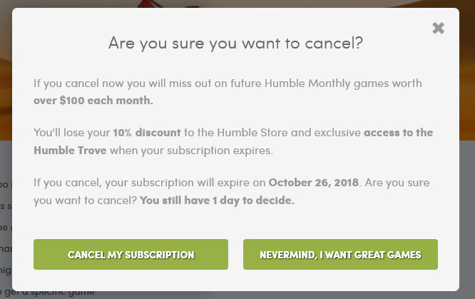
It’s never a simple yes or no, and it really should be. Examples can range from subtle put downs to outright name calling. Here are a few examples I found (source):
Choosing not to sign up for a beginner’s guide to gardening:
No thanks, I know everything about gardening
Choosing not to enter your email address to get 15% off an order:
No thanks, I’m not into savings
Choosing not to disable advert blocking on a website:
I am a bad person
The effect on mental health
- ❌ Statements like this can deeply affect users with social anxiety (also known as social phobia)
- ❌ This has a substantial effect on those with conditions such as depression, who are prone to experiencing a debilitating lack of motivation - likely resulting in them choosing the positively-framed option
- ❌ For users with panic disorders who are experiencing high levels of panic and confusion, these actions can be nearly impossible to complete in the way they first intended
For many, this is simply too difficult, particularly when they are unwell. According to Money and Mental Health, when depressed, people often lack the motivation to pursue hobbies and other pleasurable activities. At these times, engagement in essential service markets can require superhuman levels of effort. Eight in ten (82%) of our survey respondents said they found the thought… exhausting (source).
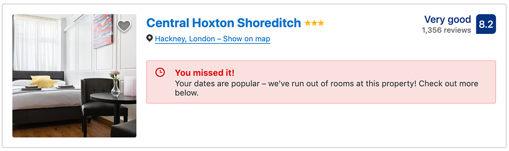
Forced urgency
I’m not a big fan of booking.com. Largely because they’re one of the biggest offenders of this dark pattern that I’ve seen. Anything on a site that places a heightened sense of urgency unnecessarily can cause a whole host of negative repercussions. They also do this on every search results page they have. I found all of these on one page:
- 😱 “In high demand – only 1 room left on our site!”
- 😨 “Booked 10 for your dates in the last 24 hours on our site”
- 😰 “1 other person looked for your dates in the last 10 minutes”.
- 🤨 “In high demand” in big red letters…two lines below a badge that says the same thing
- 😖 “33 other people looking now”
- 😤 “Last chance! Only 1 room left on our site!”
- 😡 “89% of our listings are reserved on these dates”
- 🤬 “Prices have been increasing on your dates over the past 3 days”
Even if you had no intention whatsoever of booking a room, you now have a sense of urgency forced upon you. It’s playing on the fear of missing out - IMAGINE IF YOU DON’T GET THE DEAL!
The effect on mental health
While these intrusions can be a source of irritation and stress for many people, they can be complete showstoppers for people with mental health disorders that cause them to feel anxiety, which include:
- ❌ Generalised anxiety disorders
- ❌ Panic disorders
- ❌ Psychosis
These users often like to take their time when completing actions. Rushing users can make them “feel pressured to make decisions more quickly than is comfortable for them” (source), aggravating their symptoms.
- ❌ Similarly, features like this also prey on paranoia, encouraging people to act impulsively rather than taking the time to consider the wider context.
Impulsive behaviour is a symptom of conditions like borderline personality disorder (BPD). It can compel users to make decisions that negatively affect their life without properly examining them (for example, making impulsive purchases). This is precisely what actions with time constraints encourage
You know what the worst part about this is?
It’s a lie.
Software developer Roman Cheplyaka actually did a deep dive into booking.com’s online practices in 2017, and found that, when you look into the information behind the messaging, there’s nothing at all to worry about – it’s the nature of the messages themselves (their wording, appearance etc.) that give the impression that you need to act immediately. There’s a particular button on the site that says “someone just booked this” next to a particular listing.
However, when interacted with, “just booked” was actually 4 hours ago. The notification itself appears a few seconds after the page is loaded though, giving the (incorrect) impression that it’s appearing in real-time. This is capable of alarming users with paranoia, for example, and convincing them to react immediately, perhaps even rashly, in response to the information.
Any one of the above examples would be ok by itself, but together it’s irresponsible for the sake of money. Ticketing websites are guilty of this as well. A good example is ‘virtual queues’ that form behind you whilst you’re booking tickets. It adds to that sense of “if you don’t complete this journey, someone will immediately take your place” - even if that isn’t true.
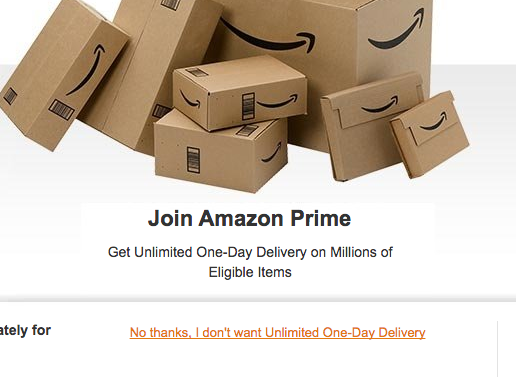
Bait and switch
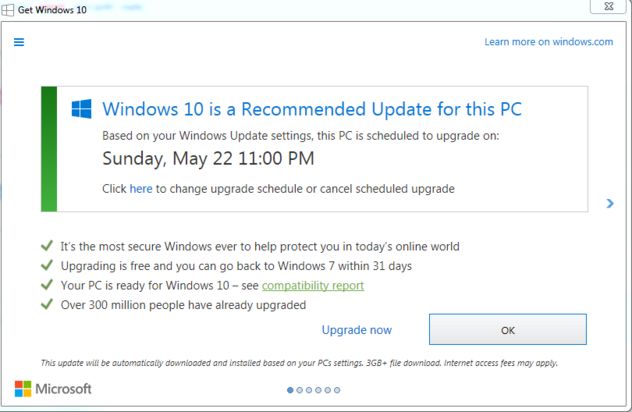
The above is a standard Windows upgrade message. It’s is a fairly routine call to action, but over time the frequency of the pop-ups increased. It started appearing as a ‘recommended’ upgrade for users, and unlike the confirm shaming we just spoke about, this pop-up didn’t have two “Yes or No” style buttons. Instead, it had one button that recommended you start the install, and only a small default ‘X’ icon in the corner of the popup to close it. Poor form perhaps, but still nothing heinous. Despite the increased frequency and change in wording, many users still weren’t upgrading and instead dismissing the popup when it appeared.
You see where this is going, right?
Then, in a particular pop-up, they changed the behaviour of the universally known ‘X’ icon which, on every one of the previous pop-ups, closed the window. Instead, clicking the icon actually scheduled the upgrade process. By doing this, they deliberately cashed in on the action that these users had been performing so consistently for nearly a year: hitting the ‘X’ icon to close it. This same concept is employed by viruses, where closing actions can trigger unexpected behaviour that does opposite of what you would expect.
The backlash was massive, and because of this an immediate patch was created to revert the change. Chris Capossela, Microsoft’s Chief Marketing Officer, said:
within a couple of hours of that hitting the world, we knew that we had gone too far.
This is called bait and switch because it’s cashing in on learned behaviour and changing the action’s effect. The “X” icon represents one of the few universally identifiable online actions, and so people trust it.
The effect on mental health
- ❌ It causes stress, leaving users feeling tricked and powerless.
- ❌ For those with learning difficulties and a lack of technical expertise, they’re left questioning what they know about computers and how they’re supposed to interact with them.
Sneak into basket
This one used to be a lot more obvious than it is now. Comet were famously caught adding an iPad case to people’s baskets online when they were purchasing an iPad. This days, businesses have gotten sneakier.
A prime example of this is the airline Jetstar. They use misdirection when it comes to selecting seats by preselecting a random one that incurs a $5 charge. Now, you can choose another seat for the same price but, most importantly, you can skip this altogether and still receive a random seat for free. The way it’s designed makes it look like an ‘opt-in’ but it’s done by default – if you don’t change the random seat and instead hit ‘continue’ you’ll be charged for a seat you don’t need to pay for. Now, Jetstar operate roughly 208,000 flights a year (4,000 flights per week), so if even one person per flight ends up paying for a random seat, it’ll equate to over $1million extra revenue per year.
It’s not just them though. GoDaddy add extra charges when you add a domain to your basket such as longer domain registration and privacy protection. In this case, it could be argued that it’s preying on those who don’t know what they need when they buy a domain.
The effect on mental health
- ❌ For people with a lack of motivation, they’re likely to simply accept the charges and keep going.
- ❌ It also preys on the impulsivity of people with bipolar disorder.
Communication anxiety
Returning briefly to the earlier Amazon example, the final step of closing your account involves having to chat to someone at Amazon via either web chat or on the phone. This is the final hurdle set up to prevent the action from happening, and give the business a chance to convince them otherwise.
Many people with mental health problems, particularly anxiety disorders, are phobic about using the telephone. This can be a significant barrier to market engagement, particularly where customers must make a telephone call to cancel an existing contract.
Many users have a feeling (quite rightly so) that the phone process may not be easy – the person on the other end may not immediately comply with what you’re asking them to do, and instead try to persuade you not to leave. We see it a lot in energy too, where companies will call up customers who are are leaving in order to try and change their mind.
The effect on mental health
- ❌ Access needs such as social anxiety and panic disorders mean that many users experience difficulties communicating with their providers, managing their accounts and getting support when problems develop.
- ❌ It can also affect those with cognitive impairments, such as Autism for example, as it “involves impairments of social communication and interaction abilities”.
- ❌ For some, being forced to use an unsuitable communication channel can trigger panic attacks or suicidality (source).
Handy reminders
Half of the battle with some of the patterns we’ve covered is that they’re so prevelant in the sites we visit every day. With some of them being so widely adopted, we can become guilty of treating them as the norm and overlooking the damage they could be doing to users. To combat this, having a constant reminder of potential pitfalls and questions to ask yourself when designing or developing a site is key.
Toptal have created a great infographic to help people do just that. You can find it, and more useful info about dark patterns, via this link.
Got to finish with a plug
These are just a few examples of dark patterns and how they can affect those with mental health issues online. If you spot anything like that on your own sites, then I’d recommend reconsidering your online practices and why they’re there. If you find examples on other sites, I’d recommend sharing them so that others can become wise to them. The dark patterns site has a hall of shame that they keep up to date with tweets from people finding dark patterns around the web.
This is a light paddle into what is a pretty deep pond, and there are many ponds like it when it comes to web accessibility. This metaphor is a little broken, but my point is that I wrote a book about this, and web accessibility in general.
The book is called “Practical Web Inclusion & Accessibility”. It’s written in a style like this and has a range of practical examples to help you along the way. If you’d like to learn more about it, or grab a copy, you can do so at https://learna11y.com.
I’ve also recently started consulting with companies again in order to help them improve their approach to accessibility. If that sounds interesting to you, you can learn more here.