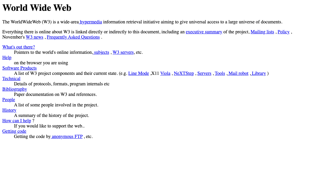
I often think about the first website ever made. It looked like this:
It is:
- ↔️ Responsive by default. It did, and still does, adapt to every screen size
- 🙌 Accessible by default. It has a clear heading hierarchy and uses correct tags
- 🥇 Easy to distinguish links from text, both in terms of colour and text formatting
- 🎧 Easily readable using a screen reader
It’s one of my favourite ever websites. I’ve seen a trend of developers whose websites get closer and closer to this design the longer they’re in the industry, like some great migration back to the roots of the internet. Gone are the flashy animations and needless JavaScript. The focus returns to the content - content that can be easily interacted with by everyone. My own website is this way, minus a small CSS animation in the corner that I remain particularly proud of (try giving it a click if you haven’t already).
I’ll say this for websites though - they’re flexible. You can take a site in nearly endless directions. This is because web browsers are frequently adding new amazing features, greater support for all users, and a lot of them auto-update to keep the web, in general, moving forward.
It is because of this, that we turn to the subject of this blog. The web is somewhat bad and getting better. Email, on the other hand, is atrocious and feels stagnant.
To think that, according to Statista, there are roughly 333.2 billion emails sent every day. Every. Day. It pails in comparison to web traffic, but that is still a mind-boggling number. It’s frankly, in my humble opinion, too many emails for how bad email is as a platform.
After a recent run in with, and contemplation of, our emails at Octopus, I want to quickly share why I believe email is very bad, and why you should consider doing next to nothing with the next email campaign or alert that you send to your users:
Problems
Email platforms have wildly differing rendering engines
Outlook renders differently to Gmail. So does Firefox, and Mac Mail, and Yahoo. Hell, Outlook even renders drastically differently depending on which version of Outlook you have. Between 2003 and 2013, here’s the journey Outlook went on when trying to decide on a rendering engine:
- 2003 - Internet Explorer used to render and display emails
- 2007 - They switched to Microsoft Word…yes seriously
- 2011 - They switched to use the “WebKit” engine (a good choice - it powers Google Chrome and Safari to this day)
- 2013 - They inexplicably switch back to Microsoft Word again
Ridiculous, hilarious, and terrifying, all in one. The result is three completely separate sets of rules and restrictions regarding how an email can be displayed, all under the same name. Here are some other fun ones:
- 😭 Form elements like checkboxes or radio buttons work in Gmail but not Outlook 2007. They will actually display in Outlook 2003, but aren’t functional in any way.
- 🤯 You can play a video in Apple Mail on iOS10 and above, but not in iOS9. It works in Thunderbird mail but doesn’t work in Gmail, and works in Outlook for Mac but not Yahoo!.
- 🤬 Adding rounded corners to part of an email works everywhere apart from in Outlook and Windows Mail (and it works in AOL webmail but not AOL desktop).
It’s actually because of these many, many issues that almost every email comes with a “view in browser” link. Most email campaign systems like MailChimp or SendGrid won’t even let you send an email without one.
Browsers are far more consistent and feature-rich than most email platforms, so many issues involving emails displaying incorrectly in platforms like Outlook or Gmail may simply disappear in Google Chrome or Firefox. This gives users another chance to interact with content they’ve been sent if it’s not displaying correctly in their inbox, or missing some accessible features (a reasonable possibility.
So, people are essentially sending emails out expecting issues. That’s a really bad starting point, don’t you think?
Note: Campaign monitor have a great, free resource that shows the level of support for CSS features and approaches in all major email platforms. As this is ever-changing, it’s an ever-useful tool. You can find it at:
https://www.campaignmonitor.com/csrs/
People don’t update their email platform
There is no auto-updating in those old email platforms. It’s most common that people update their email platform when they buy a new computer. As an example, data suggests all three of the versions of Outlook I mentioned above are still actively used.
It’s not possible for email as a platform, or the people that build emails, to innovate drastically under these conditions. Attempts at it rarely end well.
Emails with any form of media in them are destined for the spam pile
Most email campaign tools require you to build up a good “sending reputation” in order to avoid your email going straight to spam. A big thing that can impact that reputation is the inclusion of images, especially if they’re not all coming from the same web address. Many email clients now block images from displaying by default, and this is because images became a popular delivery method in spam emails. With many email platforms incorporating spam filters to keep suspicious content out of user’s inboxes, spammers turned to embedding content in images so it couldn’t be picked up as easily.
Even if they make it past the many filters set up these days to keep people’s inboxes clean and safe, there’s then the issue of loading times. Loading 5-10mb worth of images over mobile data is not a speedy process, and consumer behaviour is to most commonly give up on the email altogether if the content doesn’t load within the first 1-3 seconds.
Emails rely on an army of table tags
To generate any form of layout beyond standard “top to bottom”, emails rely on table tags to create them. The web used to be the same, but email never really moved past them.
It makes the markup very messy with a lot of nested tags, and it can be a nightmare for screen readers to read out if it’s not coded correctly (adding role=“presentation” to a table tag stops a screen reader reading it out). It’s also a nightmare for the people who build them - if you haven’t closed one of those many tables, the layout suddenly looks like you dropped the whole email on the floor.
Emails are rarely accessible
I dedicated a whole chapter of my book to detailing how bad email is in this regard. It ranges from a lack of alt text on images, poor content layout and readability, troubling contrast levels, a lack of semantic code, and an inability in many cases for users to respond. There are many more issues that require proper explanation, so I won’t do that here. If you’re interested in learning more, please do check out my book.
Any form of customisation wreaks havoc
On the web, people have now gotten used to sites adapting to their needs. If we select a dark mode, many sites pick up on this and provide us with an alternative colour scheme. If we set our device’s font site to twice the default, the font and layout of a site will invariably adapt. This is rarely the case with email. In email, it just brings further issues.
You can specify the colour scheme for dark mode users in your email code, but some platforms will ignore it outright. Others will impose its own dark mode colours instead, or opt for some strange half-way compromise between your colour scheme and theirs, which I’ve never seen end well. Add to that the fact that a lot of emails are built using fixed sizes in pixels to avoid massive differences in rendering between platforms. The result is that, if the user’s font is set twice as large, content will spill over the edges of the layout or, worse, disappear.
Solution
My professional recommendation is to keep it as simple as you physically can, at least until email shows proper signs of maturing. Some of the things you want to do may be technically feasible, but the effort vs impact makes it a no-brainier to avoid. For example, having content in two columns on desktop and then one underneath the other on mobile would take longer to build, and could well fail and end up squashing both bits of content on some platforms. Would a customer care that you were trying to put content side by side, or would they just be annoyed that their email isn’t very readable?
If you’re a service sending emails, people often rely on them to understand their bills and account. If they can’t read them, they get understandably frustrated and you could lose their custom. Your email developers also probably spends three or four times as long adapting ambitious designs to be mildly workable on older platforms as they do building the basic email design. Even with great email testing platforms like Litmus, you can’t guarantee what it’s going to look like with absolute certainty. My tips, therefore, are as follows:
- ⤵️ Have a simple, linear layout for your content. Ignore the voice in your head that says you need columns and crazy layouts
- 📚 Have a sensible heading hierarchy. Try taking any styles out of the email, and make sure that reading the content from top to bottom still makes sense
- 📏 Build your emails using relative units of measurement like rem’s or em’s rather than pixels, so that it can adapt to a user’s font settings
- 🌃 Avoid images and gifs completely
- 💻 Still offer “view in browser” links
- 📝 Send a plain text alternative that someone can view or, even better, a choice to receive by default through your system. They’re accessible, lay content out in a consistent and linear way, and never suffer from layout issues or quirks
- 🧹 Strip all unnecessary content away and, if you must keep it, relegate all but the essential to the bottom. It then becomes optional content to enjoy after reading, rather than horrid deadweight hiding the email’s purpose
Let’s see yours then
As an example, here’s what a standard email looks like at octopus:
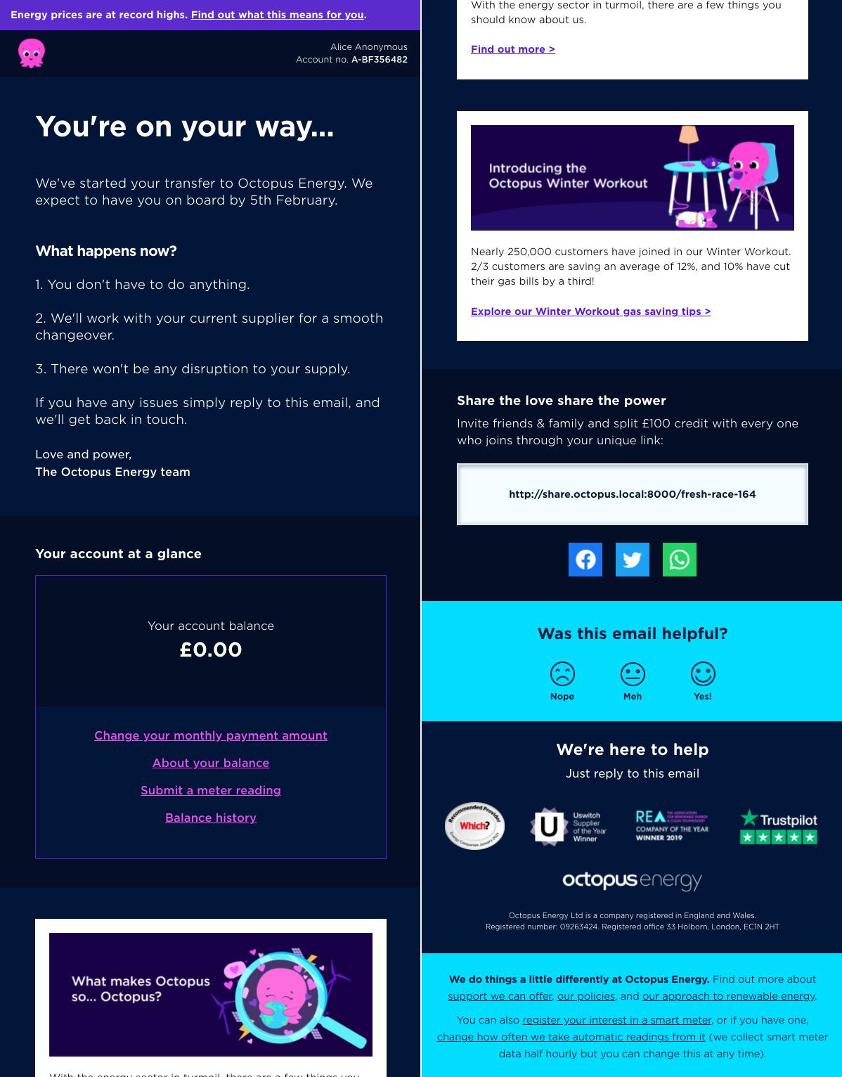
- 😌 Simple info at the top for those that don’t want to read the whole thing
- 🚣 No columns in the layout. Simple row-by-row information
- 📕 Sensible heading hierarchy
- 👀 Clear contrast between foreground and background colours, in both light and dark mode
- 🪧 Have clear links and no more than two clear, primary actions (although one is ideal)
They’re responsive, accessible, and we don’t spend an age worrying how they might look across the many platforms there are because there’s nothing complicated in them. We don’t get complaints about the information being unclear, and we always have a plain text version that we can send to people (or that they can receive by default if they’d prefer).
I understand this example is for a service rather than a campaign, but we apply the same logic for every competition, incentive, and challenge we’ve ever run. With compelling content and a clear message, you don’t need to compensate with anything else.
Overall
Even in 2022, email feels like the web did 15 years ago. So much time and effort was spent after a site was built making it even mildly usable in older browsers that people didn’t, or wouldn’t, update. We moved past this through clever auto-prefixing inventions that would take care of these differences for us in the short term, and advancements in browsers and tech, that removed these differences altogether, in the longer term.
I’m not saying that email hasn’t progressed at all. In fact, it’s likely that I’m being overly negative. Apple Mail is a shining ray of light when it comes to making emails more robust and exciting. The fact that so many people use Apple products now means that they’re dragging this old platform into a new world. But the old world remains.
On the web, people often have a choice around interacting with content. With email, content is thrown into someone’s inbox and they usually need the information contained within it. Therefore we should remember that that space is theirs, and hold the need to keep it simple of paramount importance.